Thursday, July 31, 2014

L'Oreal Limited Edition Neons with Comparisons

For Summer 2014, L'Oreal released the textured Miss Denim collection plus a six-color Neons group, which is what I have today. Left to right: Fluo Azur, Flashing Lilac, Acid Watermelon, Punchy Lychee, Energetic Tangerine, and Banana Pop.


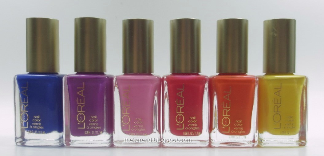
These are all cremes, and since I have a low tolerance for cremes at the moment, I did not do full hand swatches of these. I Skittled the four warmest and brightest shades together. Top to bottom: Acid Watermelon (pink), Punchy Lychee (red orange), Energetic Tangerine (orange), and Banana Pop (yellow). All were three coats except, surprisingly, Banana Pop, which was two.


I'd call Punchy Lychee a neon, and could see extending that desgination to Energetic Tangerine as well. Both dry to a satin finish, which is characteristic of polishes which contain neon pigments, and both show the slightest hint of visible nail line, which leads me to believe they'd pop over a white base. Acid Watermelon and Banana Pop are bright, yes, but I wouldn't call them neons.

I tried a white base under the last two colors, Fluo Azur (blue) and Flashing Lilac (purple). Fluo Azur was two coats and dried satin, so I'll allow it into the neon club. Flashing Lilac was three coats, and wasn't quite as satin when dry as Fluo Azur so it's on probationary status as far a neon qualification.


I am currently awash in summer cremes, so of course I did some comparisons. First up, I have a perfect illustration of cool versus warm pink with L'Oreal Acid Watermelon and Maybelline Pink Punch (from this summer's LE Bleached Neons).


Alternating below, starting with L'Oreal on the left. The Maybelline looks practically orange when sitting beside the cool-toned L'Oreal.


Next up, L'Oreal Punchy Lychee versus Julie G Miami Beach (from this summer's Cruise collection). Top to bottom: Miami Beach 1 coat over white, Punchy Lychee 2 coats over white, Punchy Lychee three coats alone, Miami Beach two coats alone. These are a bit closer than the pinks I compared above, but in no way are they dupes. Miami Beach leans more pink and is a true opaque creme; the white base makes pretty much no difference. Punchy Lychee is more red, and the white base makes a definite difference.


Top to bottom: Miami Beach one coat over white, Punchy Lychee two coats over white, Punchy Lychee three coats alone, Miami Beach two coats alone. These are a bit closer than the pinks I compared above, but in no way are they dupes. Miami Beach leans more pink and is a true opaque creme; the white base makes pretty much no difference. Punchy Lychee is more red, and the white base makes a definite difference.


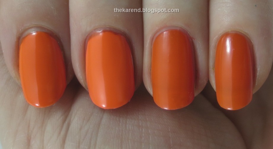
L'Oreal Energetic Tangerine got matched up with OPI Juice Bar in a battle of the oranges.


Left to right: Juice Bar two coats over white, Energetic Tangerine ditto, Energetic Tangerine three coats alone, Juice Bar ditto. These are pretty darn close. The L'Oreal is a smidge brighter over white and a smidge less shiny, but I don't see that one would need both.


I pulled a full complement of yellows to compare: Wet 'n' Wild A Venice Day, L'Oreal Banana Pop, Julie G Canary Islands, and Funky Fingers Alex's Lemonade.


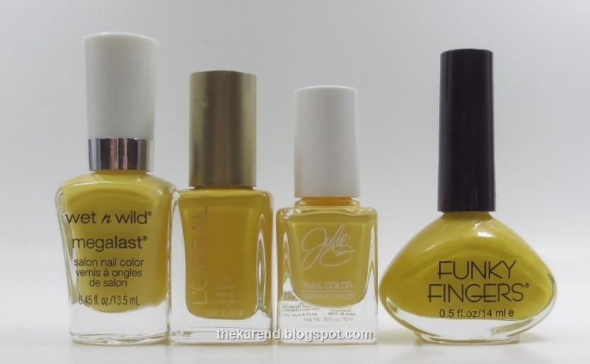
Top to bottom: Wet 'n' Wild two coats over white, L'Oreal three coats alone, Julie G three coats alone (almost two), Funky Fingers two coats alone (this one is lemon scented when dry). I put the Wet 'n' Wild over white because I had previous experience with it and knew it to be more neon-esque than these others. The Wet 'n' Wild is the brightest of these and the L'Oreal the deepest. The Julie G leans ever so slightly pastel, and the Funky Fingers comes the closest to what I think of as a pure yellow.


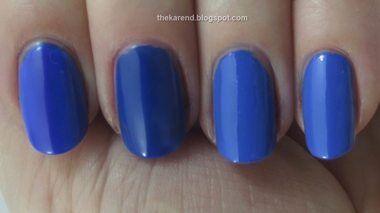
For the blues, I grabbed Sally Hansen Xtreme Wear Pacific Blue—the old creme version, which was recently replaced by a shimmer (see Nouveau Cheap for the story)—and NYC Ocean Blue (from this summer's City Samba display).


Left to right: L'Oreal two coats over white, L'Oreal three coats alone, NYC two coats, Sally Hansen two coats. The L'Oreal shows its neon-ness here, popping over the white and drying less shiny than the two true cremes. Alone, it's darker than the other two blues; over white, it's still a tad darker. They NYC looks to have a touch less white in it than the old Pacific Blue, but it's close enough that it would make a fine substitute if you didn't stock up on Pacific Blue when the panic hit the nail-o-sphere.


In the purple category, I reached for Orly Purple Crush and OPI Push and Pur-pull (yes, that's cello tape you see on the handle; since the minis don't have names printed on them, I cut the names off the box and tape them on).


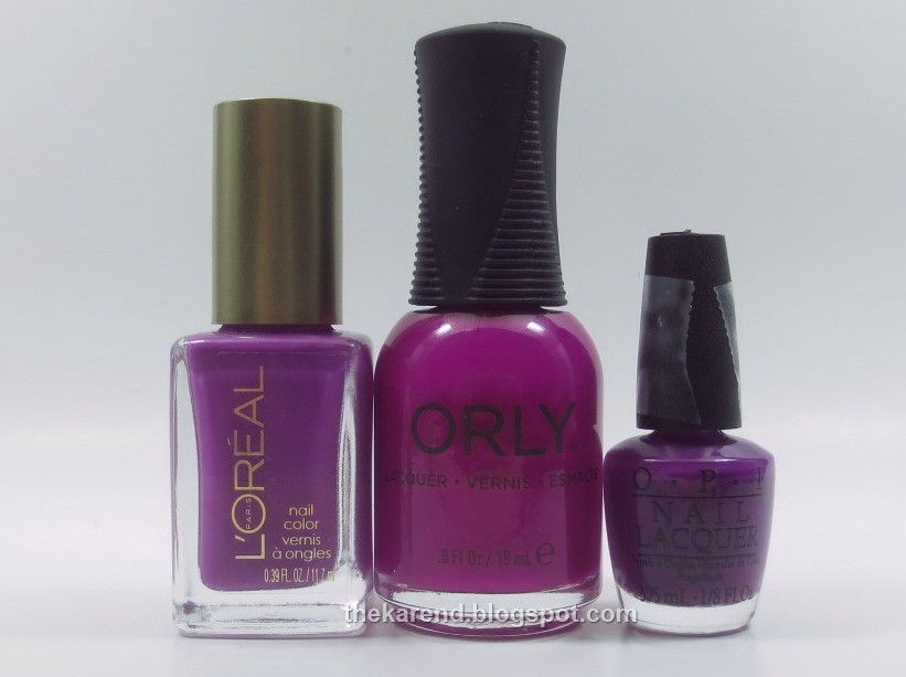
Top to bottom: OPI three coats over white, Orly three coats over white, L'Oreal three coats over white, L'Oreal three coats alone.


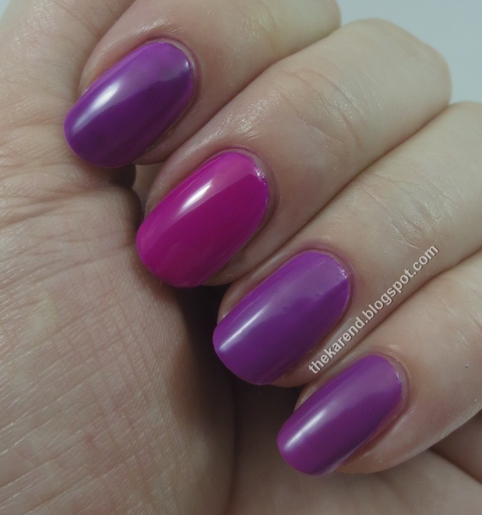
Obviously the Orly is the odd polish out here, being much closer to pink than purple. The OPI is close to the L'Oreal; since having the Orly in between makes it hard to see that, I did a contortion to get them side by side below. I was surprised that the white base didn't make more of a difference to the L'Oreal.


So I'd score L'Oreal a three and a half out of six as far as the neon-ness of their Neons. There aren't any bad colors here, but there aren't any groundbreakers either.

Wednesday, July 30, 2014

Wheel O6: Ornaments and Other Glitters

Yet another glitter wheel for Nail Wheel Wednesday, this time dominated by colors scooped up from holiday displays when brands that don't have a core line appear.


1. Ornaments unnamed silver (4 coats) [pretty sure these first 7 are Ornaments, from the winter holiday mini sets from 3 or so years ago]
2. Ornaments unnamed silver/red (3)
3. Ornaments unnamed rose pink (4)
4. Ornaments unnamed red (4)
5. Ornaments unnamed red violet (4) [worth doing four coats]
6. Ornaments unnamed blue (4)
7. Ornaments unnamed gold (3) [very yellow gold]
8. Ornaments Icicles unnamed silver (3)
9. Ornaments Icicles unnamed multi (3)
10. Ornaments Icicles unnamed red (2)
11. Ornaments Icicles unnamed fuchsia (3)
12. Ornaments Icicles unnamed purple (2)
13. Ornaments Icicles unnamed blue (3)
14. Ornaments Icicles unnamed green (2)
15. Maybelline Express Finish Pink Pizzazz (2)
16. Naturistics Super Shine Shimmer (2)
17. Naturistics Super Shine Ice Crystals (2)
18. Lancome unlabeled mini (3)
19. Wild and Crazy Purple Glitter (4) [not sure if dark base is intentional or result of glitter bleeding]
20. W7 Cosmic Mauve (2)

Bottles 1 through 7:


8 through 14:


15 through 17:


18 through 20:


Tuesday, July 29, 2014

Maybelline Color Show Veils

Today I've got swatches of all five of the Maybelline Color Show Veils, which the display calls "textured top coats", and I suppose that's technically true in that everything has a texture, even if that texture is smooth, but these are layering shimmers and glitters rather than what we nail mavens think of when we talk of textured polishes. Left to right: Amethyst Aura, Teal Beam, Crystal Disguise, Blue Glaze, Rose Mirage.


Amethyst Aura has medium sized purple hex glitter and very fine silver glitter in a clear base. I layered two coats of it (plus topcoat) over Maybelline Day Glow Teal.


Teal Beam has small matte glitter in turquoise and pale yellow green plus fine gold shimmer. I did two coats of it plus topcoat over Maybelline Walk in the Park, a very dark green creme.


I used black creme as a base for the next two, Crystal Disguise and Blue Glaze. Both of these are shimmer toppers; in the bottles, Crystal Disguise looks more white and Blue Glaze looks more blue, but on the nail over black, it was reversed. In the photo below, my top two fingers have two coats of Crystal Disguise over the black, and the others have two coats of Blue Glaze.


Close up of Crystal Disguise:


Close up of Blue Glaze:


Rose Mirage has small metallic hex glitter in rose gold and coppery orange in a clear base. I layered it over Maybelline Coral Heat and then added topcoat.


Overall, Maybelline got a nice variety in this small collection--a warm glitter and a cool one, matte and metallic glitter, shimmer. I just wish they'd replaced one of the shimmers with a flakie. I know they know about flakies; the Colorama line had some.

Monday, July 28, 2014

Finger Paints Enchanted Mermaid Collection

Lately it seems Sally Beauty puts out a new Finger Paints display every month; the one for July was Enchanted Mermaid, which promised "mermaid tail texture". I didn't know what that meant, but the colors looked nice, so I grabbed all four: Sea Temptress (pearl), Underwater Enchantress (dusty olive green), Tails of Love (teal), and Sailor's Lure (blue).


By the time I got around to trying these, I'd seen some other people's swatches, and the colors didn't seem to look nearly as good on the nail as in the bottle. Thus instead of committing to full hand swatches of each, I Skittled them, and boy was I glad I did, as they looked yucky and lumpy to me. I used three coats of Sea Temptress (index finger, top in photo below) and two of the others (same order as bottles above).


After some initial skepticism—I wasn't ready when Jason Wu and CND did the Anna Effect back in 2011, for sure, and was in the "looks interesting but not sure it's for me" camp when the first OPI Liquid Sand colors showed up a couple years later in the Mariah Carey collection—I got on the textured nail polish train. I like texture now; I've got a Zoya PixieDust on my digits as I type, actually. That said, this texture looks wrong to me, because it's quite clearly glitter in there, and in my view, glitter should show, not be submerged in shimmer. At least when Sally Hansen did it with in the Xtreme Wear Fall 2010 release, the glitter was somewhat visible; here, it's just buried.


I added topcoat, which smoothed these out to the touch but not so much to the eye. I was still "nope" on these.


Since topcoat didn't work to make me like these, I decided to try layering. That didn't help. Top to bottom: Sea Temptress (3 coats alone, for comparison purposes), Sailor's Lure plus Sea Temptress, black creme plus Sea Temptress, black creme plus Sailor's Lure plus Underwater Enchantress. Just no.


I was feeling stubborn the day I swatched these, so pondered how I could use them in a way they wouldn't bother me. I decided the Pretty Woman Seashells nail art kit languishing in my stash was just the thing; mermaids and shells go together, after all.


I alternated Underwater Enchantress and Tails of Love on my nails, then patted on the crushed shell pieces from one of the pots in the kit while the polish was still wet. I didn't do a great job covering all my nails, but I could overlook that because I really liked how the colors coordinated.


Pretty as the shells were, they took texture to a whole 'nother level, the catching on my hair and clothes level, which does not work for me. To see if I could smooth things over and make this look even more mermaid-y, I topped the shells with a coat of Pure Ice Sparkling Seas (which you may remember from last week's Pure Ice and SinfulShine post) and then clear topcoat. Now this I liked; this I'd wear. The blue of Sparkling Seas did overpower most of the shell colors, and one layer of topcoat wasn't quite enough to level out all the spaces between the shells, but I've got ways to deal with that (i.e. Gelous). At this point, the Finger Paints were not really showing through at all, which was okay by me.


So yeah, I like the Enchante Mermaid colors best when they are covered up by a lot of other stuff so I don't have to see their texture. I'm not saying no one should wear these; I'm saying I don't think I will be, at least not on their own.